
First of all, did you know that you don't need to collect the data yourself to be able to analyze it? If you decode data from the spacecraft it gets stored on your local machine for analysis, but you can also download a copy of ALL the data collected by everyone, just for your review. There are two steps to this:
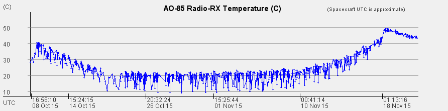
Now you can go to the AO-85/Fox-1A tab and analyze the data. Here is a typical graph for the Temperature of the radio. It is showing the last 1000 samples of data. The default is 180 samples. You can show more by typing 1000 into the field beside "plot" and then press enter.
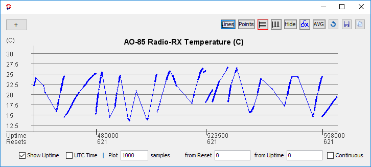
It is worth noting a couple of things. First the data is not continuous. It is in chunks as it was received by ground stations around the world. The little dots are the actual samples received. The labels on the bottom axis are also chunked. They are a bit sparse because it is difficult to calculate the label values for lots of separate data chunks, something I can no doubt improve in future versions.
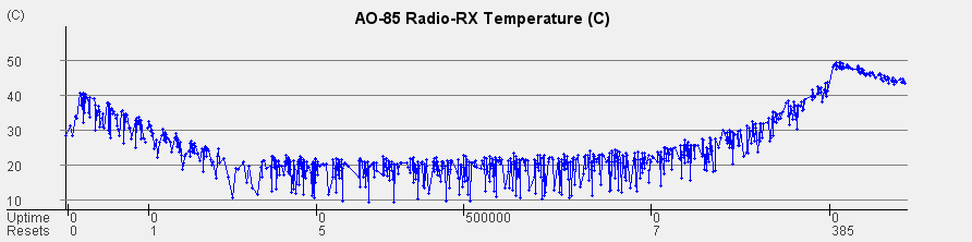
You can click the "Continuous" check box to change the plot and space the data out as it was actually received. You then get a graph like this:
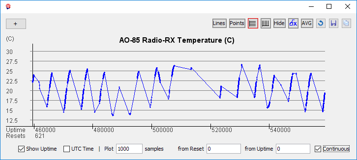
That may or may not be what you want. Now it looks like a set of orbits, with data received at different times, but we have connected points with lines that may not be valid. There could have been data in betweem.
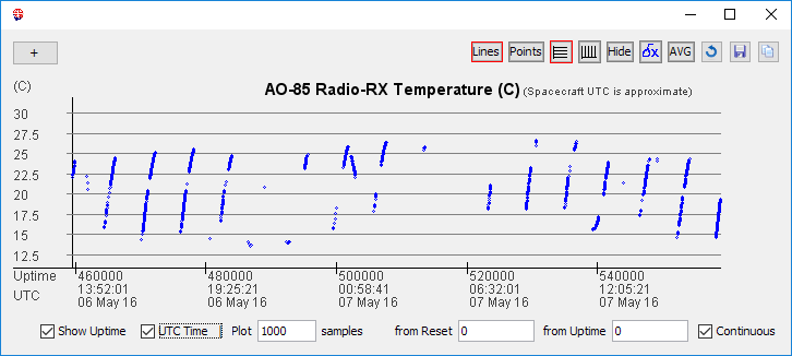
We have a better set of labels on the horizontal axis. Reset 621 means the computer on board Fox-1A has rebooted 621 times. This is either because something went wrong with the software and the watchdog timer rebooted the computer or an energized particle corrupted the memory causing it to crash. In that case the memory is restored from a clean copy in ROM and we reboot. The uptime is the time in seconds since reboot 621.
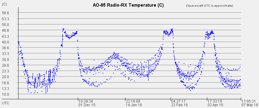
The AMSAT operations team calculates the UTC time of each reset and we store it on the server. FoxTelem pulls those values down and you can see them from the Spacecraft menu by selecting the spacecrafts name. The "Time Zero" table shows the date/time that each reset occurred. So, if we check the box that says UTC and we click the button top right labeled "Lines" then we get a plot like the below. This is a more accurate picture of what is actually going on.
Staying with the Receiver Temperature graph, we can put the number "1" in the "from Uptime" field and keep "UTC Time" checked. Let's look at the first 180 samples that were received when Fox-1A was launched. You can stretch the graph a bit so that it plots more horizontal labels if you want. You can toggle "Continuous" on/off to get a feel for the different data it shows you. You can turn the lines on/off by toggling the "Lines" button.
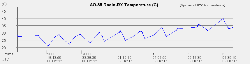
The initial concern at launch was that the spacecraft was hot. Right away the receiver was at 30C and the temperature quickly climbed to 40C. While well within design parameters, this was hotter than expected. This time the graph is copied using the "copy" button on the top right of the window. Use this to share graphs over email or to paste into documents.
If we change the number of samples plotted from 180 to 35000 then we see a longer chunk of data, about 1.5 months from launch. I have toggled "Show Uptime" off. We can see that the temperature fell at first, rose dramatically and then seemed to peak. This was quite a concern. If you leave your radio on the dashboard of your car in the middle of summer it might not get this hot. Put your hand up if you thought space was supposed to be cold :)
It is interesting to toggle off the UTC Time and toggle "Show Uptime" back on to see the number of times that the spacecraft was forced to reboot. On the 15th of November, at 14:14 UTC the spacecraft rebooted 376 times!
I will let the Amateur Scientists in the community ponder why that was. You can use FoxTelem to see what happened to the systems on the spacecraft and in particular the onboard experiment from Vanderbilt University.
If you stay with the Receiver Temperature and put 200000 samples in the "plot" field then we get a very interesting graph that shows the temperature build up was temporary, that the "peak temperature" actually shows two peaks and that the temperature drops back off to a quite "normal" 14C-25C. Notice also that toggling "Continuous" or plotting lines vs points starts to make less difference once we have lots of data, but it is showing us something different. Which is important if we want to make scientific measurements. Also notice that when I ran this, 200000 was all of the samples available to us. When looking on the AO-85/Fox-1A Health tab I saw that there are 209,000 payloads (as of 7 May 2016) and some of them were min/max payloads. So 200000 grabbed all of the available real time payloads.
In FoxTelem Version 1.04 or later we can plot one value against another. Perhaps the most important value for the health of the spacecraft is the battery voltage, so let's plot that against the Receiver Temperature. There is a plus sign to the top left of the graph. We select the additionally trace BATT_C_V for "Battery C Voltage" and we get the plot below (click on it to get a larger version):
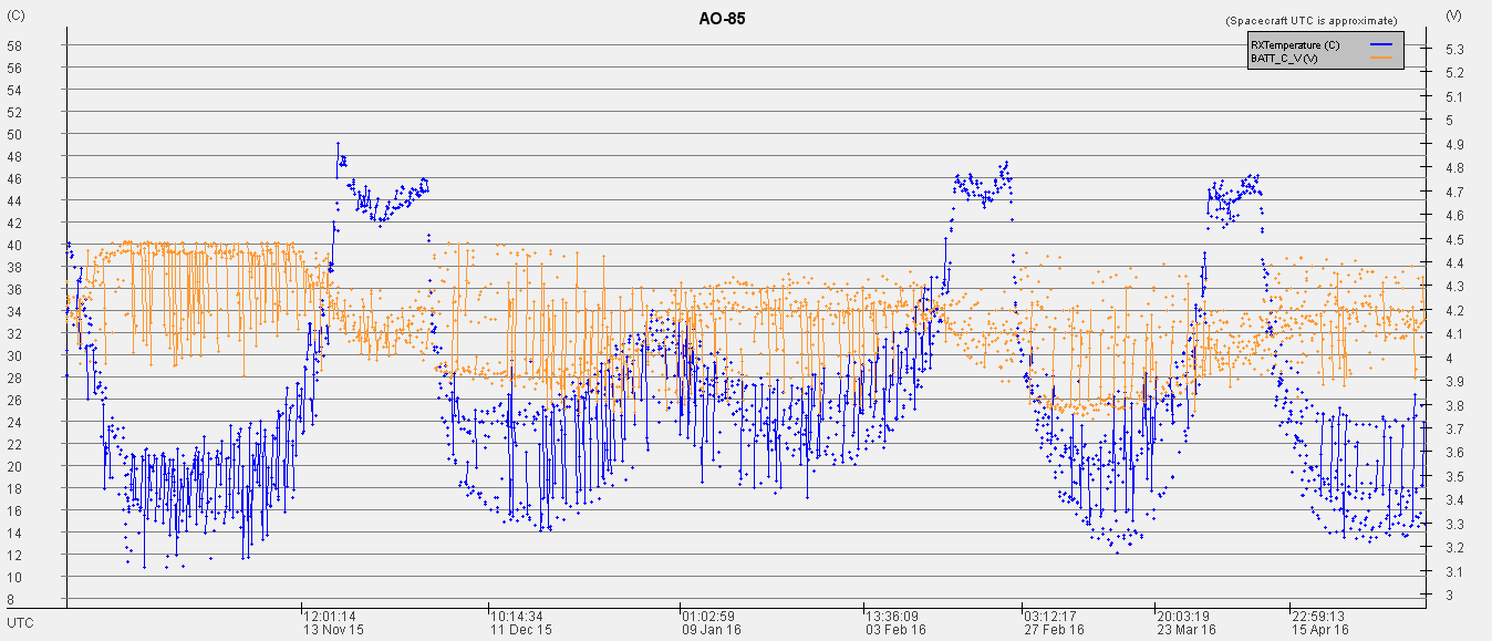
Now things are getting interesting. We can see that the battery voltage varies with the temperature of the spacecraft, which is perhaps not a surprise, but does it vary in the way that we expect? Radios and mobile phones seem to fail when it is very cold. Here we see a lower, tighter range of battery voltage when the temperature is higher. Just after launch the battery range was from 4.5V to 3.9V. During the first November, 2015 hot cycle the battery range narrows to something like 4.1V to 3.9V. This then repeats in the February, 2016 hot cycle and the most recent April hot cycle.
Notice also that the battery voltage shows a slight overall downward trend from left to right, showing that eventually the battery will no longer hold sufficient charge and we will operate on solar power only. Which is part of the design.
There are many other things to investigate. I propose a short list below for you to ponder, to experiment with, and perhaps to write down and send in thoughts about. We have theories on many of them, but a big part of launching a satellite like Fox-1A is for people to learn about space. So investigate the data yourself, ask questions when you don't understand and share your findings with your kids, at your school, with your club or just with your self. The AMSAT journal is also looking for papers that investigate for your own enjoyment.
Things to investigate
Footnote 1: Keep in mind during your analysis that not everything on Fox-1A works as expected. Firstly, the "BATT_C_V" voltage is really the bus voltage as measured by the computer because the Battery I2C bus has failed. The PSU current also seems to be binary due to an issue with the sensor. Finally the SPIN sensor is experimental and needs calibration. There are perhaps other issues, let us know if you see anything strange.
Footnote 2: There are many things that FoxTelem could do, or could do better. Feel free to suggest ideas. Many have been given already. For example, why doesn't it work with the RTL dongle? Or the Airspy? Or the new cool looking Airspy mini? Why can't I put in a range of dates to make a graph? What's with this crazy 'plot x samples' scheme? And so on. Feel free to suggest other things. It is a volunteer project and features get added or improved as time is available.
73
Chris, g0kla.
Enter Comments Here:
| On: 12/28/19 13:13 Robert Culbertson wa3ygq said: |
| On: 01/05/21 15:15 John Ferguson said: |
Thanks for the guidance. Very helpful! |
| On: 05/05/24 10:10 said: |
Copyright 2001-2021 Chris Thompson
Send me an email